For the past couple of months, I’ve been rethinking the visual style of my home on the internet: this website, the one you’re on right now.
In this blog post, I’m going to share some of the ideas I’ve had along the way – including the ideas I’ve thrown away!
As it was
For most of the past decade, iterations of this website tilted towards minimalism.
The homepage of this blog has consistently been an austere layout with a smattering of introductory text with sans-serif typography. Often, but not always, the colour scheme for the whole site has consisted of mostly an off-white and not-quite-black, with sparing dash of a single shade of cyan1.
Over time, I’ve experimented with different visual flourishes.
I’ve tried a range of different header styles, including collapsing hamburger menus with glowing auras, like this:
I had been gradually iterating towards a more glassy version. Up until this refresh, I’d been using some next-level glass effects:
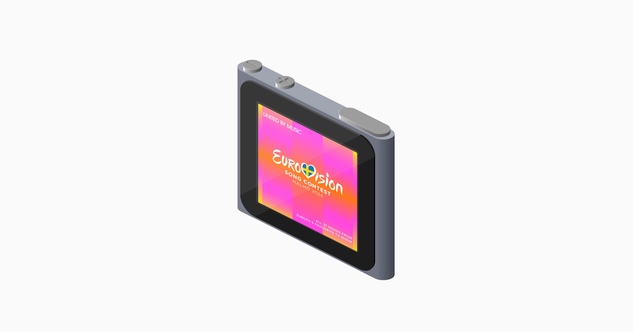
Over the course of the past year or so, I’ve also added digital simulacrums of physical objects, like Post-It notes and iPods nano.
Mostly I’ve liked how lots of these elements have worked individually, even if I didn’t love how they sometimes sat together.
Throughout, I’ve often also been trying to ruthlessly optimise my code: if I could squeeze out a few dozen bytes of CSS or javascript code, then that’s what I was going to try to do! Less complex code means it’s less likely to break, after all.
Towards neubrutalism
After 6 years though, I’ve gotten bored. My taste has changed. Evolved. And it was time for my website to do the same.
I’ve fallen in love again with pop artists like Roy Lichtenstein and Andy Warhol, and neo-expressionists like Keith Haring and Jean-Michel Basquiat.
So I’ve decided to lean into a more neubrutalist style. Heavier lines. Bolder use of blacks and bright colours. That sort of thing.
What I’ve got right now isn’t a radical departure from what came before but it has given me inspiration for what it might evolve into over the next half a decade.
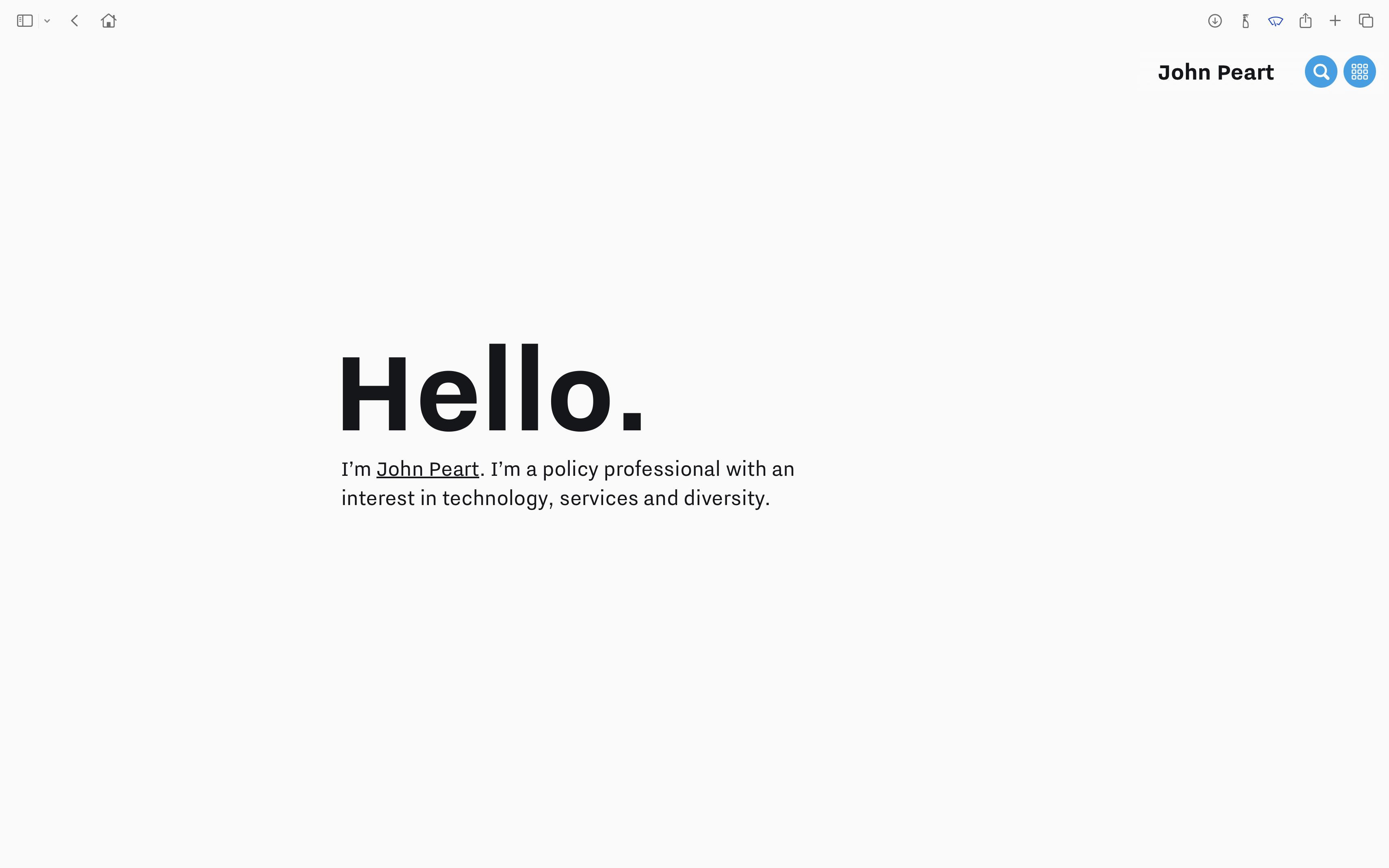
The biggest change is probably to the home page.
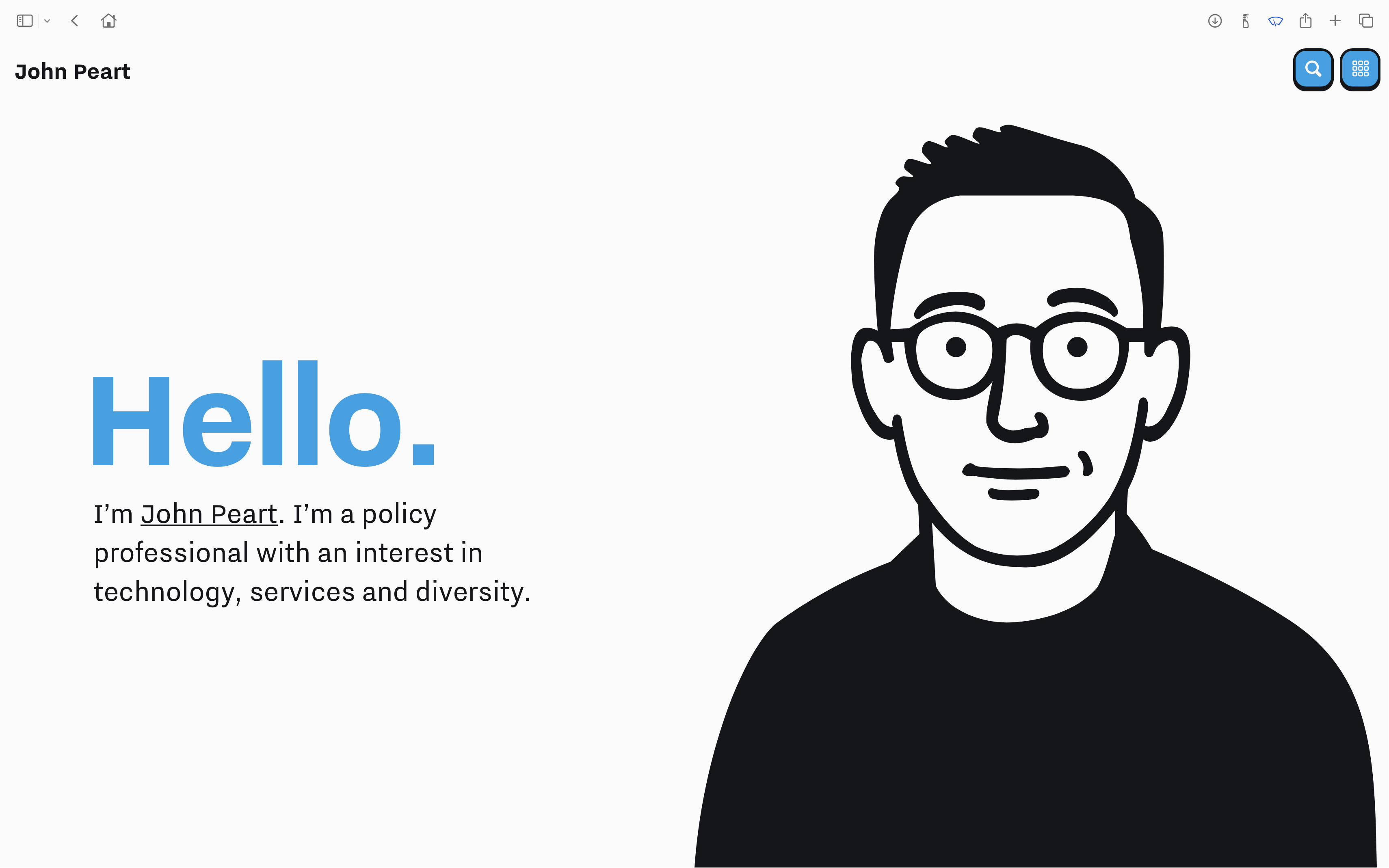
For the first time, my home page has an image on it. Of me, even. Groundbreaking, I know.
I love the illustration I’ve come up with; though I’m sure I’ll be endlessly fiddling with it now. Especially if I decide to change my haircut in the future!
Use of bold imagery has been a focus as I’ve explored this new design. Keeping an element of continuity with what came before, I’ve been creating a lot of isometric profile images, just to see how they looked.

I haven’t used most of these, in the end, but I have kept them in case inspiration strikes in the future about where I could.
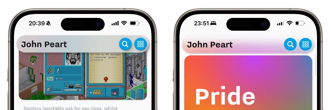
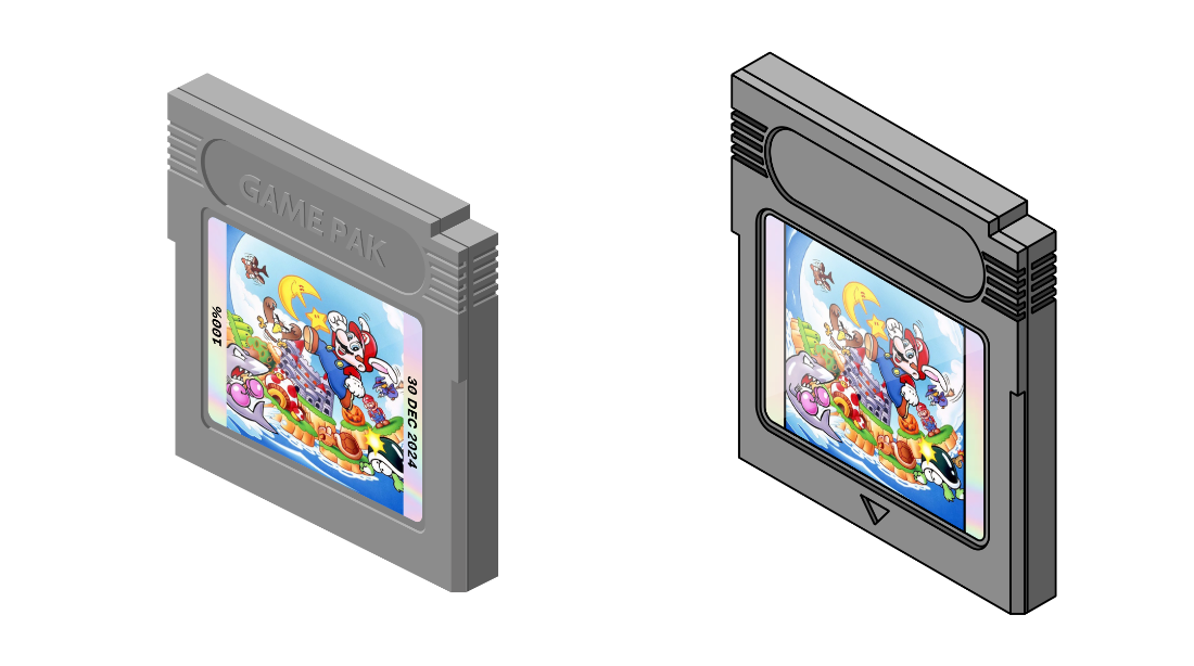
Where I used objects like Polaroid photos, and Nintendo Game Boy cartridges and consoles in my previous design, these have also been revamped. Gone are the shadows and soft gradients; now they have a bolder, blockier aesthetic.
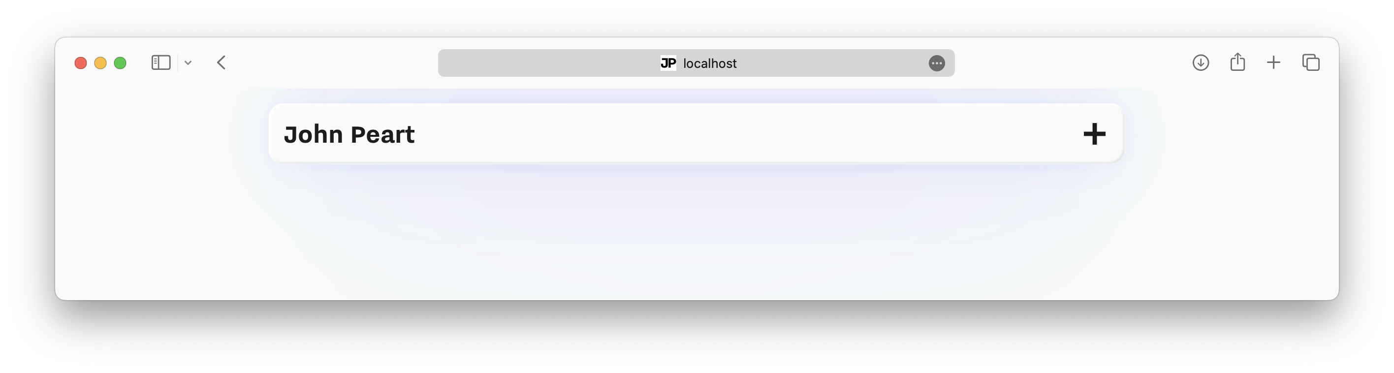
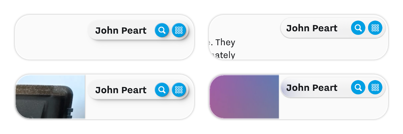
The navigation bar is the other most visually striking change to the site.
Scroll back up to the top of the page, and you’ll notice the bar disappear into seamlessly into the background, thanks to scroll-driven animations. Roll over a colourful image, and notice it take on a vibrant, over-saturated hue; keeping a nod to the glassy aesthetic of the previous designs.
What’s next?
Not everything has changed in this design change. It’s more “refresh” than “complete overhaul”.
There is still more room for change! That’s going to keep my brain busy noodling for months and years to come.