 John Peart
I have noticed something that I cannot un-notice from a company that is renowned for its attention to detail. It has to do with typography1.
In recent months and years, Apple — yes, that Apple — have been launching a flurry of new devices, software and services. Many pages have been written and much ink spilled about the success of each. I want to focus on the period since 2014: since the announcement of the Apple Watch. That is the start of the typographic nonsense.
A quick trip back in product time
But in order to look at the present, a short detour to the past is necessary, and specifically at names of things in Apple’s history.
The names of Apple’s hardware and software have always been a bit all over the shop. We’ve had the eMac and iMac, MacBook, MacBook Pro and MacBook Air, the iPod, iPhone and iPad, the Apple TV and HomePod. That’s just the hardware.
With Apple’s operating system software we’ve had Mac OS X, iPhone OS, iOS, Apple TV Software and watchOS to name a few2.
Basically, there’s been very little consistency in the names of things. One thing has been consistent though: the typography.
‘Mac’ has always been capitalised. ‘MacBooks’ always with the uppercase ‘B’. The use of ‘i’ before products, and ‘e’ before that — however meaningless the letter was — has been consistently a lowercase letter, followed by an uppercase letter. There was an internal typographic logic, even amidst the chaos of the product names themselves.
Not so with Apple’s products since 2014.
Typographic hell starts in 2014
It’s 9 September 2014 and Tim Cook stands on the stage at the Flint Center for Performing Arts in Cupertino, California. He unveils Apple’s newest device.
Apple watch. Small caps.
Except it’s also Apple Watch — title case — when it’s anywhere other than in the logo.
30 June 2015. Tim Cook announces “one more thing…” at Apple’s Worldwide Developer’s Conference. This time, a service.
Apple music. Also small caps.
The use of small caps in Apple’s product typography is inconsistent with everything else Apple sold at the time, but it’s at least — by mid 2015 — starting to become a new kind of consistency.
Except not, because Apple music (small caps) sometimes is also Apple Music — title case. That’s not to mention:
- Apple Pay (title case)
- Apple Pencil (title case)
- AirPods (camel case)
- HomePod (camel case)
And then there is the worst of them all: ‘Apple tv+’ and ‘Apple tv 4ᴋ’.
Not ‘tv+’ small caps or even ‘TV+’ normal caps, but ‘tv+’; lowercase. Not ‘TV 4K’, but ‘tv 4K’ — both lowercase for something traditionally uppercase (TV), and also uppercase for something traditionally uppercase (4K).
Bananas.
It gets worse in the visuals
Reader, I’ll level with you. I could overlook these totally bananas inconsistencies, I really could. But then they went and did the full logo designs.
I mean, just look at them!3
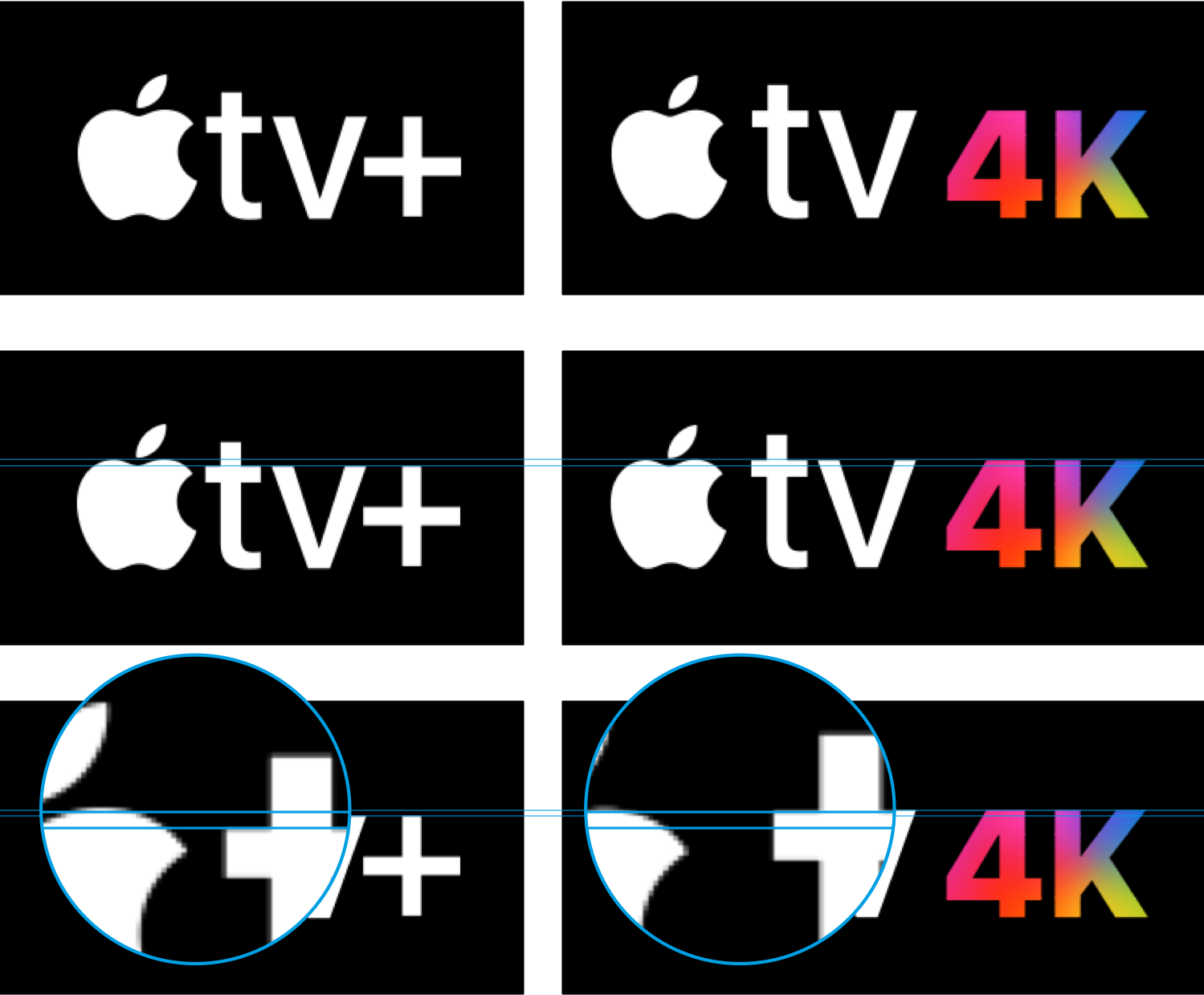
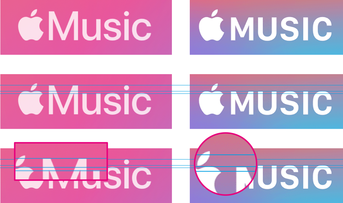
The text’s x-height is different in each.
Lowercase letters in some wordmarks align to the very top of the core of the apple logo; in others they don’t quite reach. Uppercase letters with an aligned cap height in some wordmarks inexplicably match the cap height of small caps in others.
And now you’ve noticed it too, haven’t you? It’s enough to make your toes curl, and I promise you this; it cannot be unseen.
Footnotes
Yes, ‘typography’; not ‘fonts’. Fonts are files that package up the designs of letters and characters, otherwise known as typefaces. Simplistically, typography is turning typefaces into visually pleasing layouts. ↩︎
Mercifully, the names of Apple’s operating systems do now appear to have a consistent naming — and, importantly, typographic — logic: macOS, iOS, iPadOS, tvOS and watchOS. ↩︎
All these assets have been borrowed straight from Apple’s websites or apps with no alterations, aside from adding horizontal lines to emphasise size differences. ↩︎